Nep LogisticsAI-Powered Financial Operations Platform
Designed the interface layer for an autonomous financial platform: making invisible AI decisions visible, trustworthy, and actionable for CFOs managing multi-regional operations.
Nep Logistics operates shipments across 5 regions. Finance teams processed hundreds of invoices, bills of lading, and customs documents manually — exceptions surfaced only at month's end. My job was to design the interface for an AI backend that already existed but had no face: no one trusted it because no one could see it.
The hardest part wasn't showing data — it was deciding what to hide.
Finance teams had no real-time visibility across regions. When AI automation was introduced on the backend, it had no interface — teams couldn't see what the system processed, what it flagged, or why. Automation existed, but it was invisible, so no one relied on it.
Designing for CFOs meant navigating two extremes: they need a 30-second overview and the ability to drill into any number within seconds. A dashboard that shows everything is as useless as one that shows nothing.
The design challenge: Build a system where the user only sees what genuinely requires their attention — and trusts everything else to the AI.
AI decisions must be visible before the user relies on them
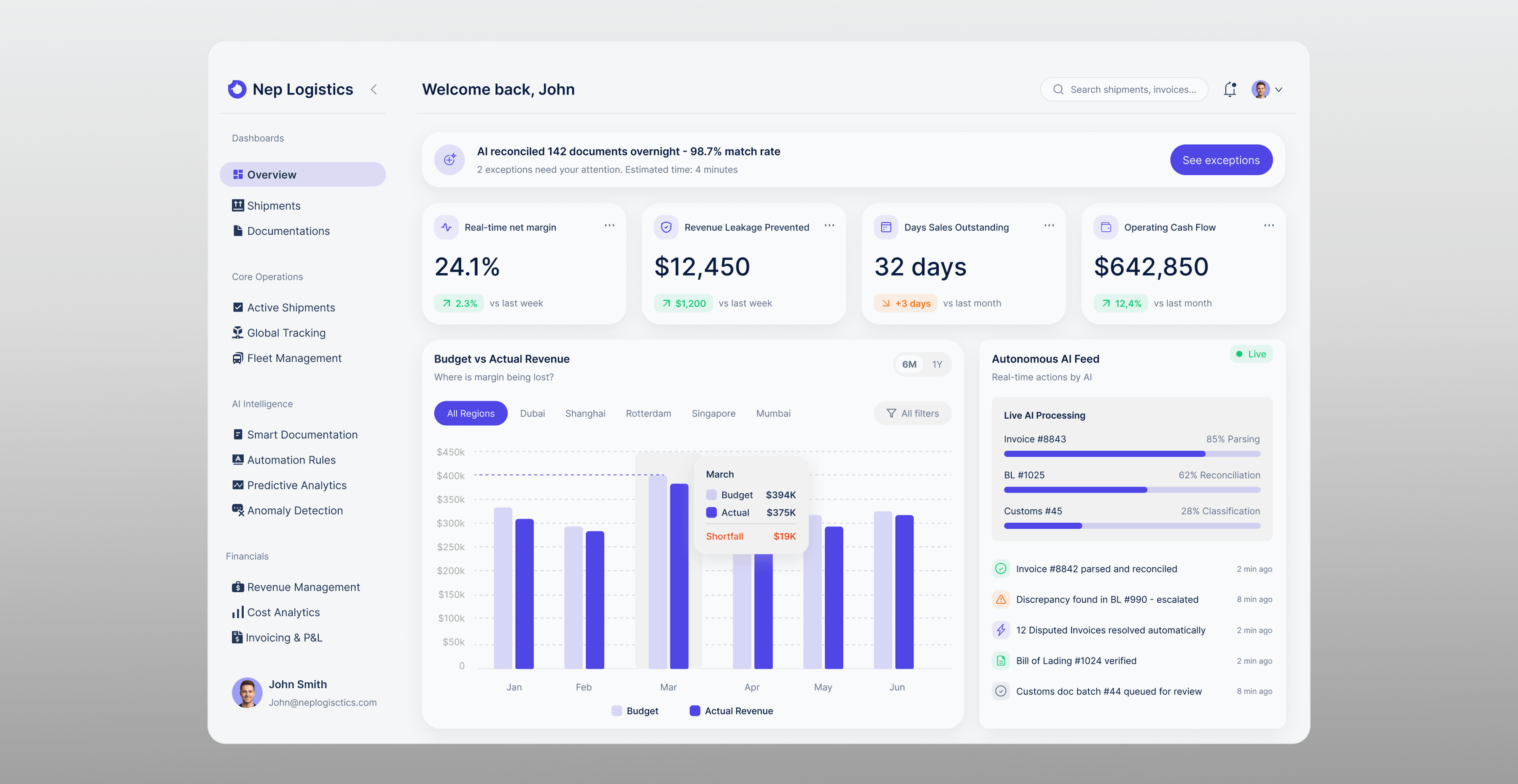
If the system processes 142 documents overnight, the CFO needs to know that before reading any metric. I placed an AI status banner at the very top — what was processed, at what confidence rate, and what needs attention. This single element reframes everything below it: the user reads with context, not blind trust.
Surface only what requires a human decision
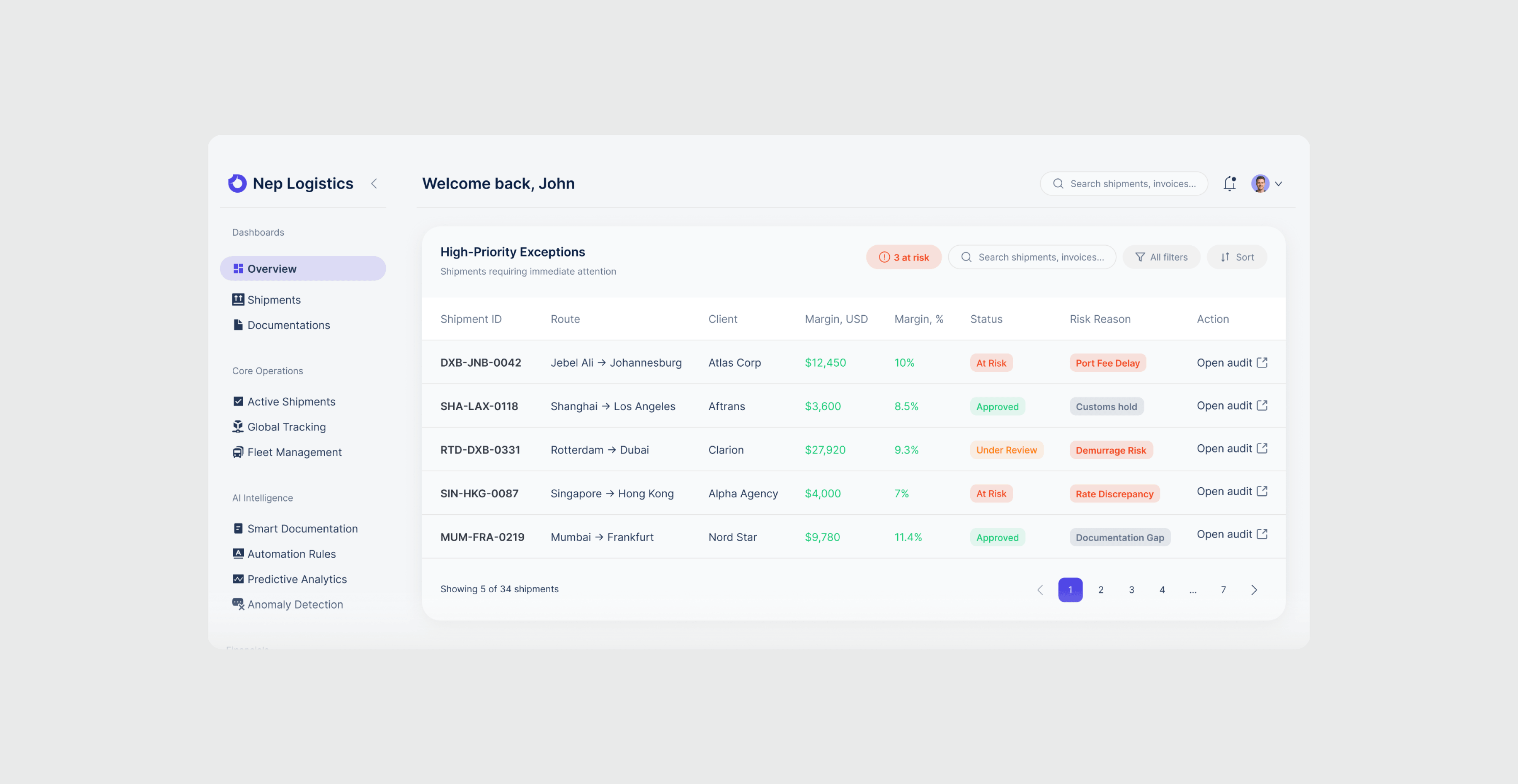
Every metric competes for attention. I designed an exception-first hierarchy: exceptions ranked by dollar exposure appear on the main screen, everything else sits one click away. The user's first action is always the highest-priority one — without manual sorting.
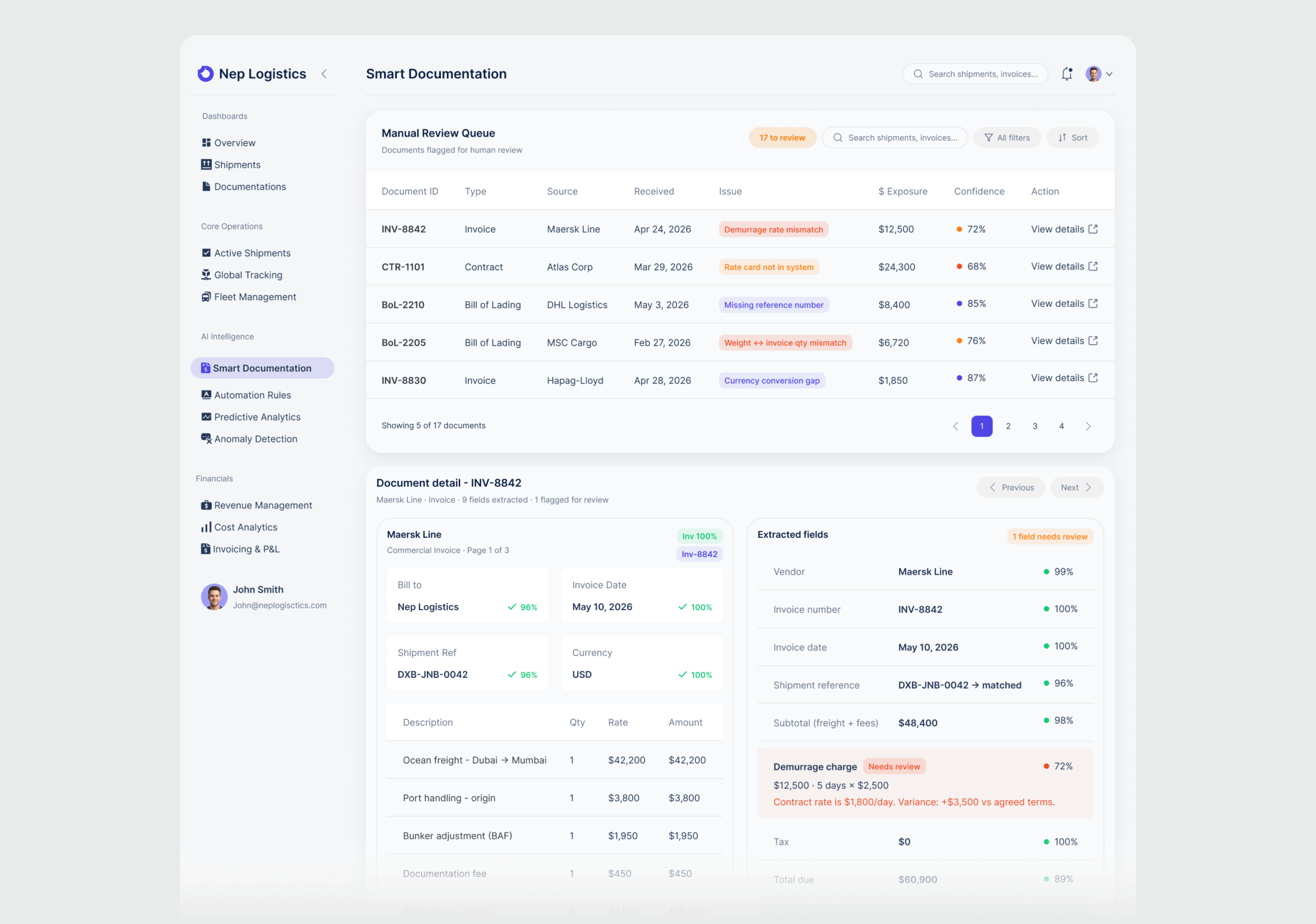
Confidence at field level, not document level
A document can score 96% overall and still be wrong on the one field that triggers a $12,500 charge. I brought confidence scoring down to individual fields, with the exact discrepancy and dollar impact shown inline. The reviewer sees what is wrong, why, and what it costs — before opening the original document.
Executive Overview
Elements prioritized by decision urgency: critical metrics and AI status at top, trend analysis in the middle, exceptions at the bottom.
- AI banner surfaces processing results before any metric — turns automation from black box into accountable system
- KPI cards track what finance teams actually act on daily: net margin, revenue leakage, days outstanding, cash flow
- Budget vs Actual isolates margin deviation by region without leaving the overview
- Every AI action timestamped and labeled: parsed, reconciled, escalated — decisions traceable before teams rely on them
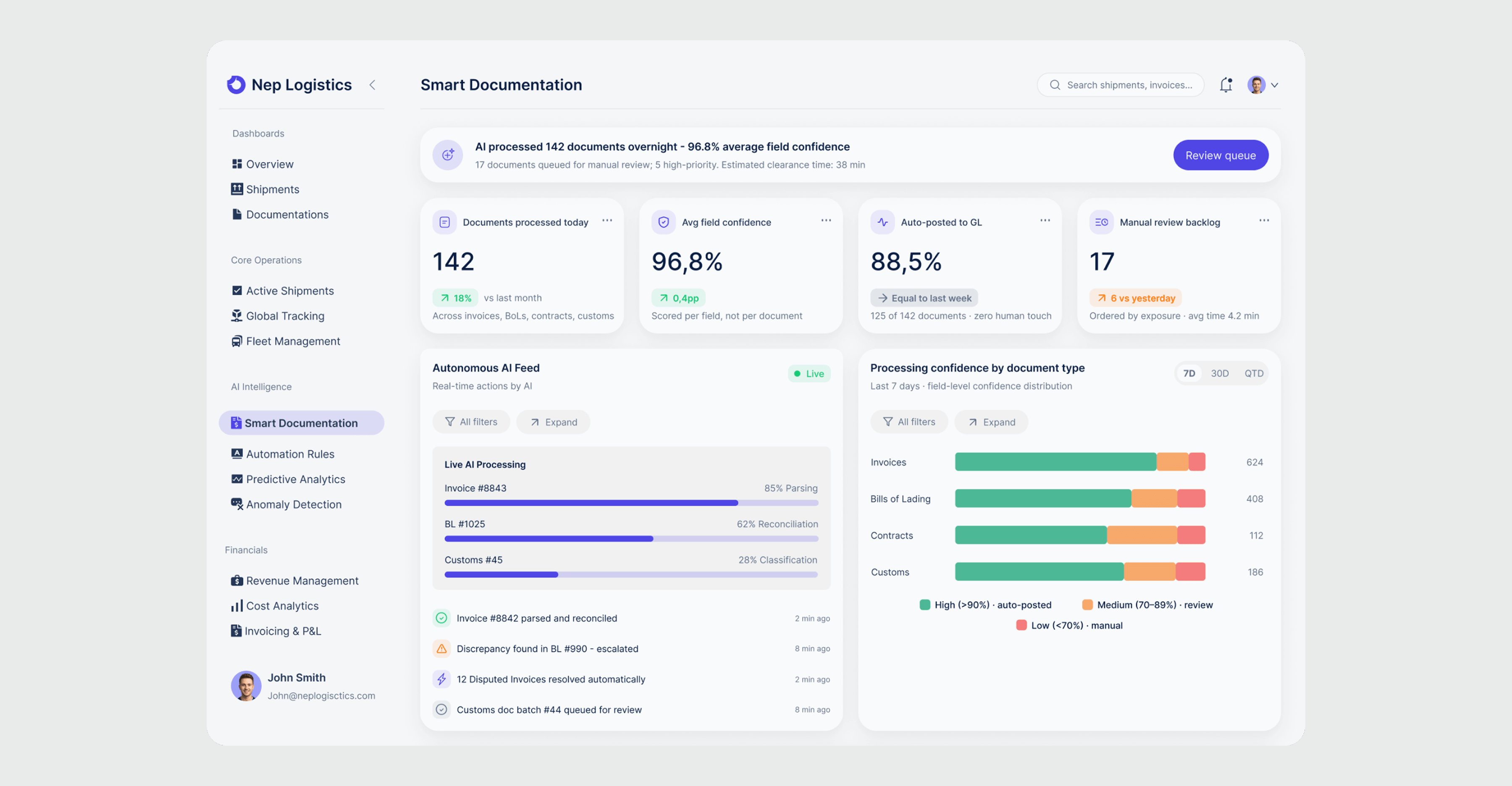
Smart Documentation
Rather than running silently in the background, every automated action surfaces in real time with confidence scores, processing status, and a clear separation between what AI handled autonomously and what requires human review.
- Processing confidence broken down by document type (Invoices, BoLs, Contracts, Customs) — three tiers route documents: high auto-posts, medium queues for review, low flags for manual extraction
- Manual Review Queue ordered by dollar exposure, not arrival time — each row shows the specific issue so the reviewer knows exactly what to check before opening the document
- Document detail shows original and extracted fields side by side with per-field confidence scoring
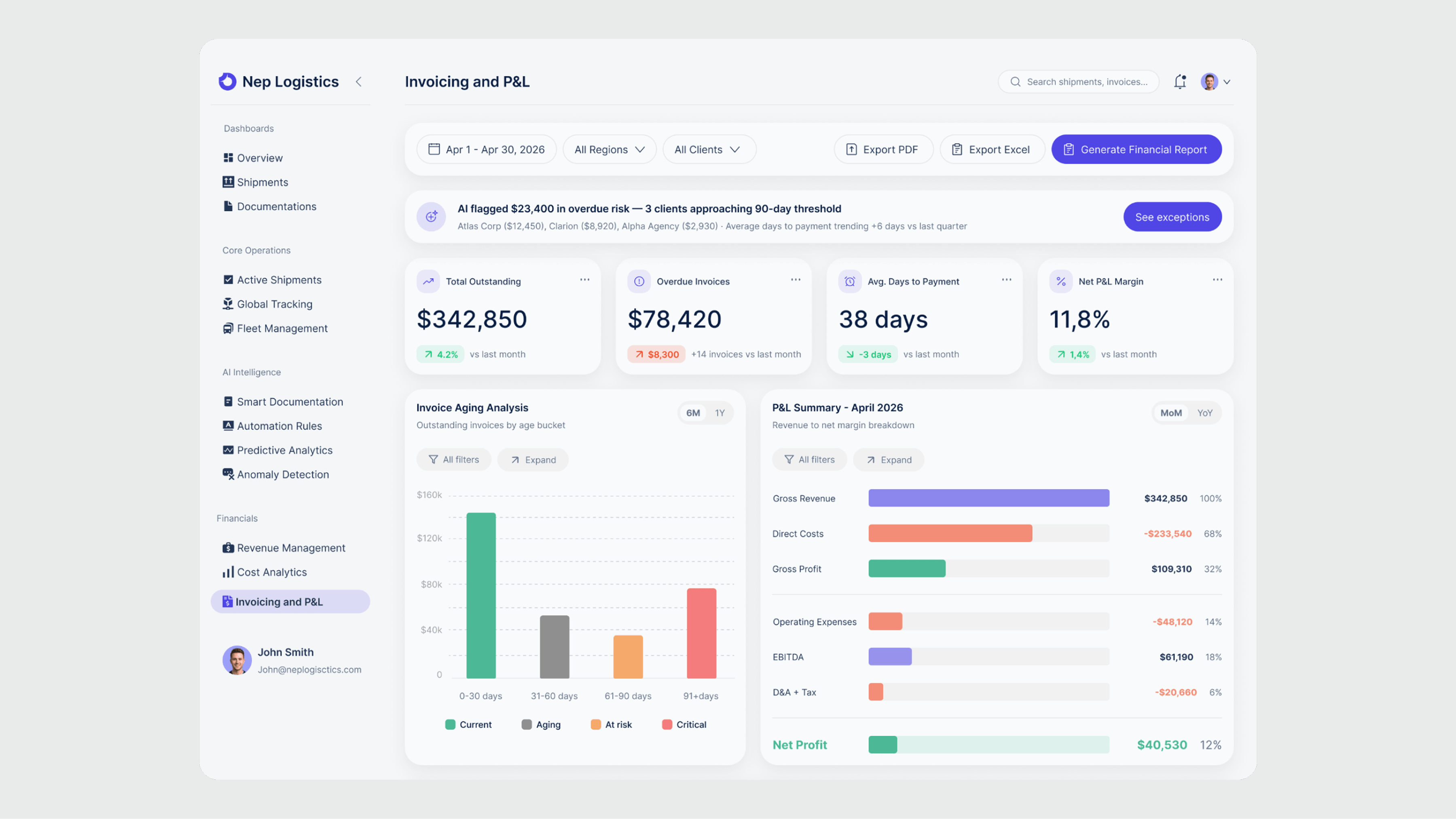
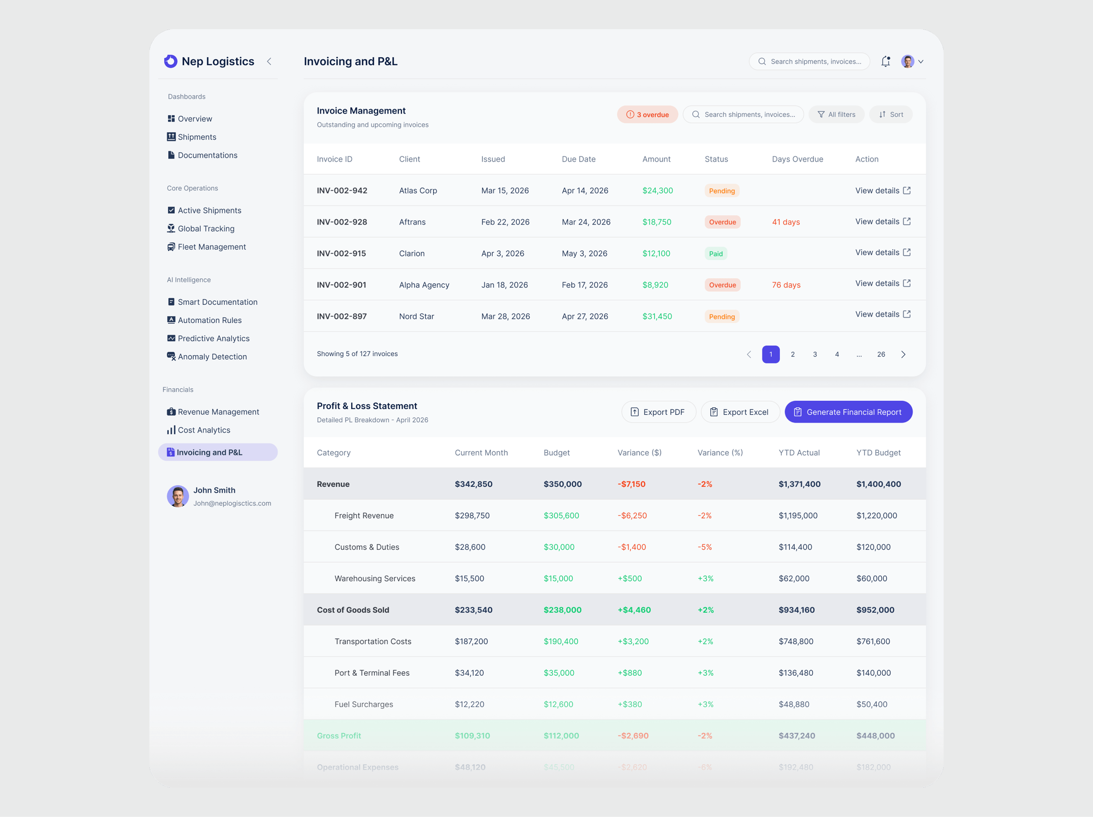
Invoicing and P&L
Consolidates what finance teams previously managed across multiple spreadsheets: invoice aging, margin breakdown, and payment tracking in one view.
- Invoice Aging breaks outstanding invoices into four risk buckets (Current, Aging, At Risk, Critical) — color coding maps directly to urgency
- P&L Summary uses horizontal bars showing the full margin waterfall from Gross Revenue to Net Profit — each line includes percentage of revenue
- Global filters at the top apply across all widgets simultaneously, eliminating the need to configure each section separately
Invoice reconciliation, data entry, and exception tracking replaced with autonomous processing
Margin leakage, overdue payments, and high-risk exceptions surface proactively instead of at month's end
Finance teams adopted automation faster when they could see exactly what the system was doing and why. Visibility into AI decisions reduced the need for manual verification.
New regions and additional shipment volumes absorbed without adding manual overhead; the system maintains the same confidence rate
Good information architecture is about subtraction, not addition. Every screen improved when I removed something — not when I added more data.
The non-obvious finding: designing for AI transparency solved a trust problem, not just a UX problem. Finance teams didn't resist automation because it was hard to use — they resisted it because it was invisible. Making every AI action visible and reversible was the unlock.
Next step: usability testing with real CFOs to validate whether the exception-first hierarchy matches their actual mental model of priority.